Nava Rastegar

Graduate Student at the University of Maryland, Baltimore County. Researching the potential uses of spiderwebs as citizen-science air pollution monitors with Drs. Chris Hawn and Dillon Mahmoudi.
View my LinkedIn Profile
Exploration of Measured and Projected Air Quality in Baltimore City
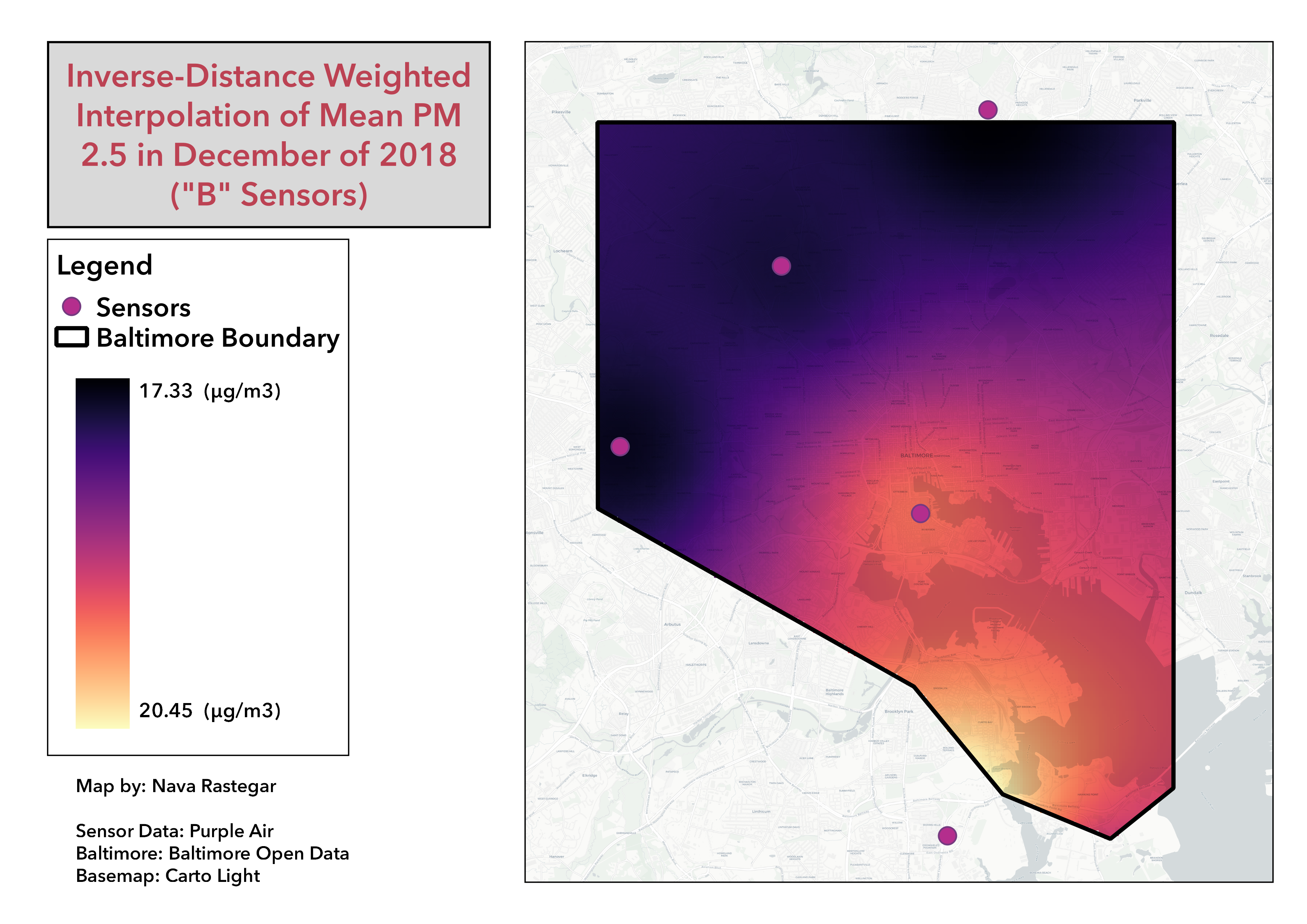
Project description: I used an inverse-distance weighted interpolation to project the air quality of Baltimore city during December, 2018. I obtained data from all of the outdoor sensors in or near Baltimore city during the month of December, 2018 that could be downloaded from purpleair.com. For each sensor, I calculated an arithmetic mean of all measurements of atmospheric PM 2.5 ug/m3 collected during that period. Each sensor came equipped with two different monitors, so I mapped the “A” and “B” sensors seperately. Generally, the maps were very similar, with only +/-2 ug/m3 difference maximum. However, with so few data points these small difference created obvious visual differences in the IDW’s shown below.

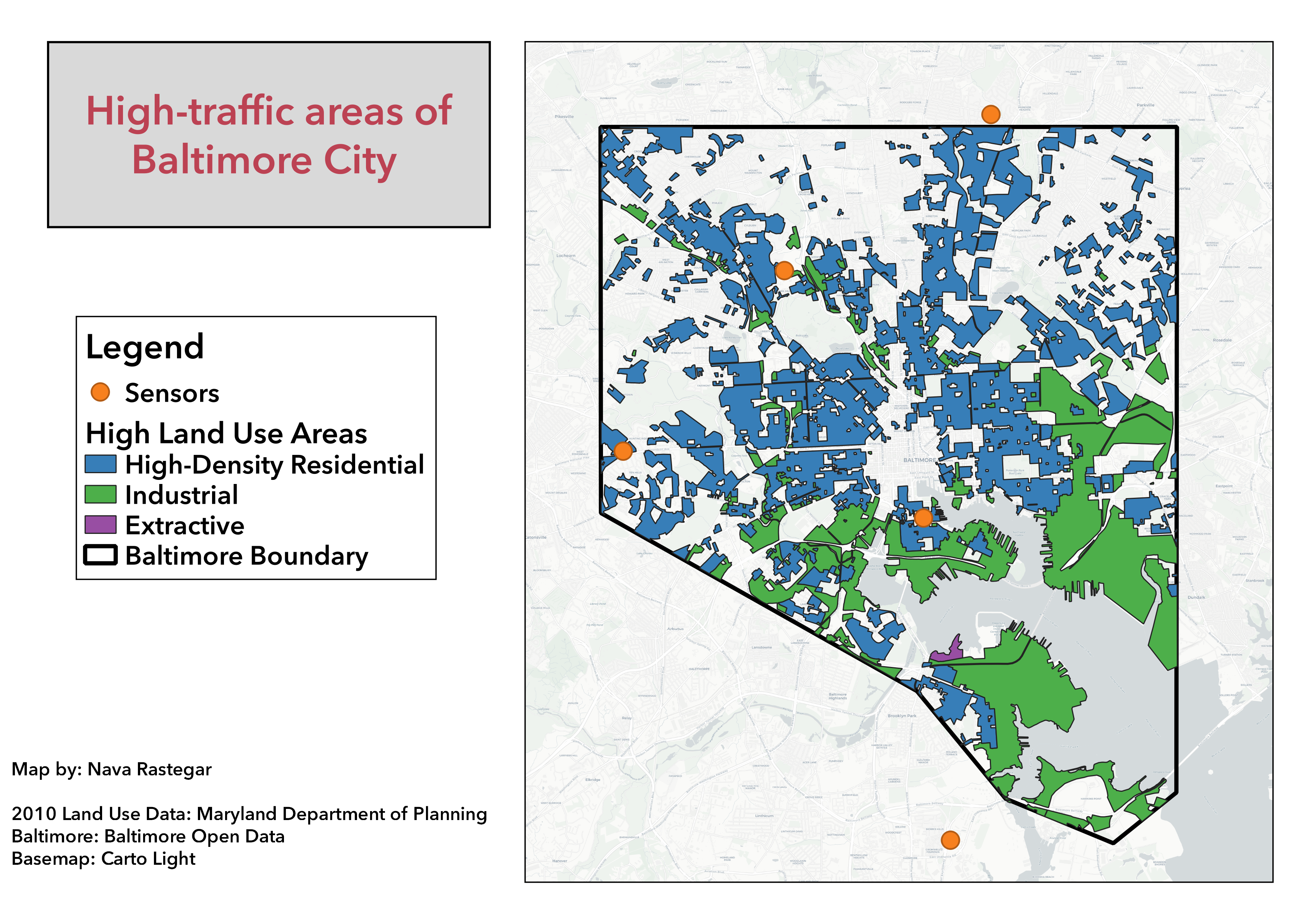
Below you will find a map of land use in Baltimore city to compare to my maps of PM 2.5. Keep in mind that the most recent available land use data is from 2010.
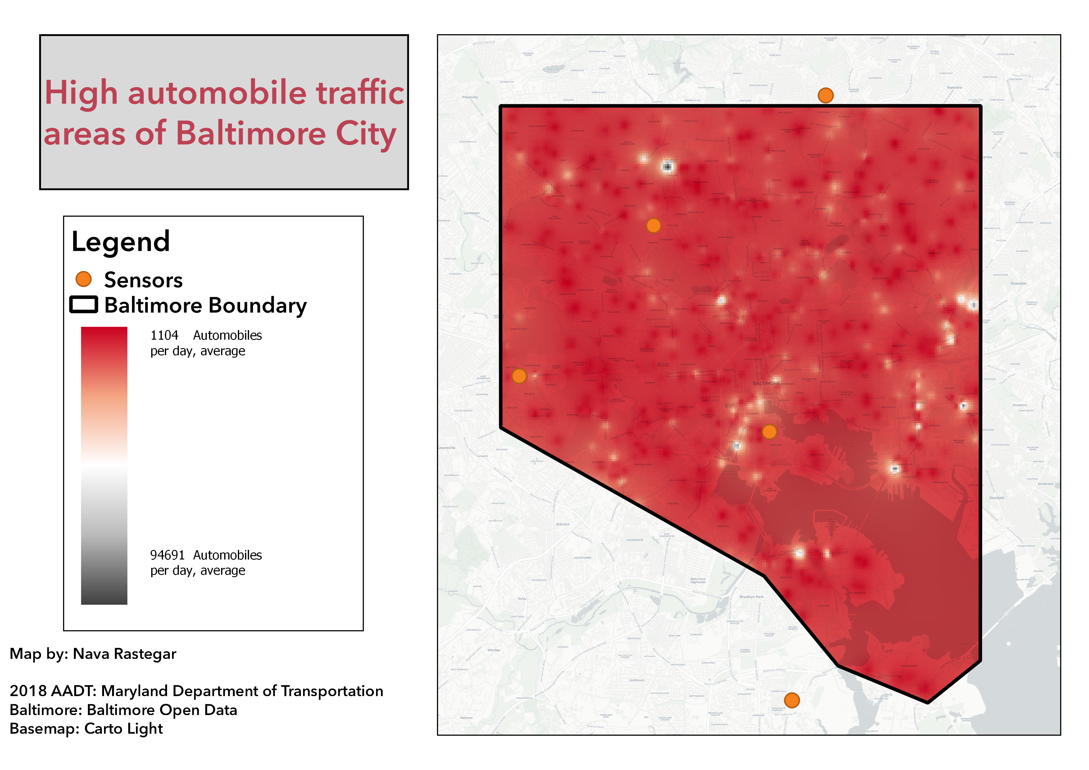
I created an IDW using Average Annual Daily Traffic (AADT) data from 2018. The highest traffic, and presumably the highest pollution areas, are the white and gray spots. Notice how small and distributed these hot spots can be.
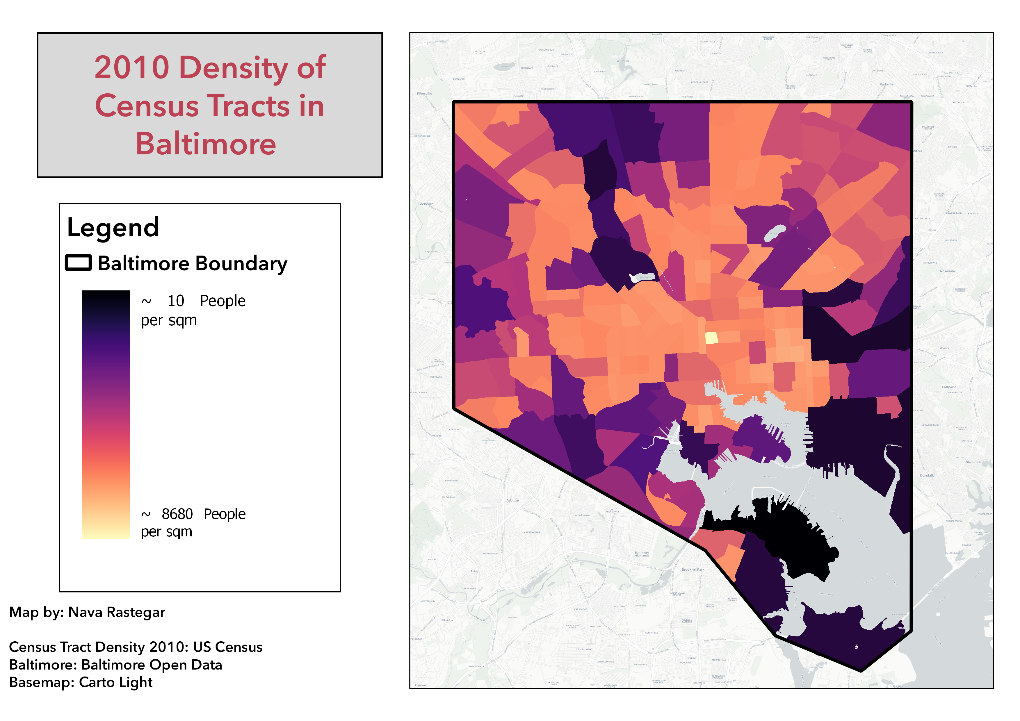
Finally, I created a map of the density of Baltimore census blocks as of the 2010 census.
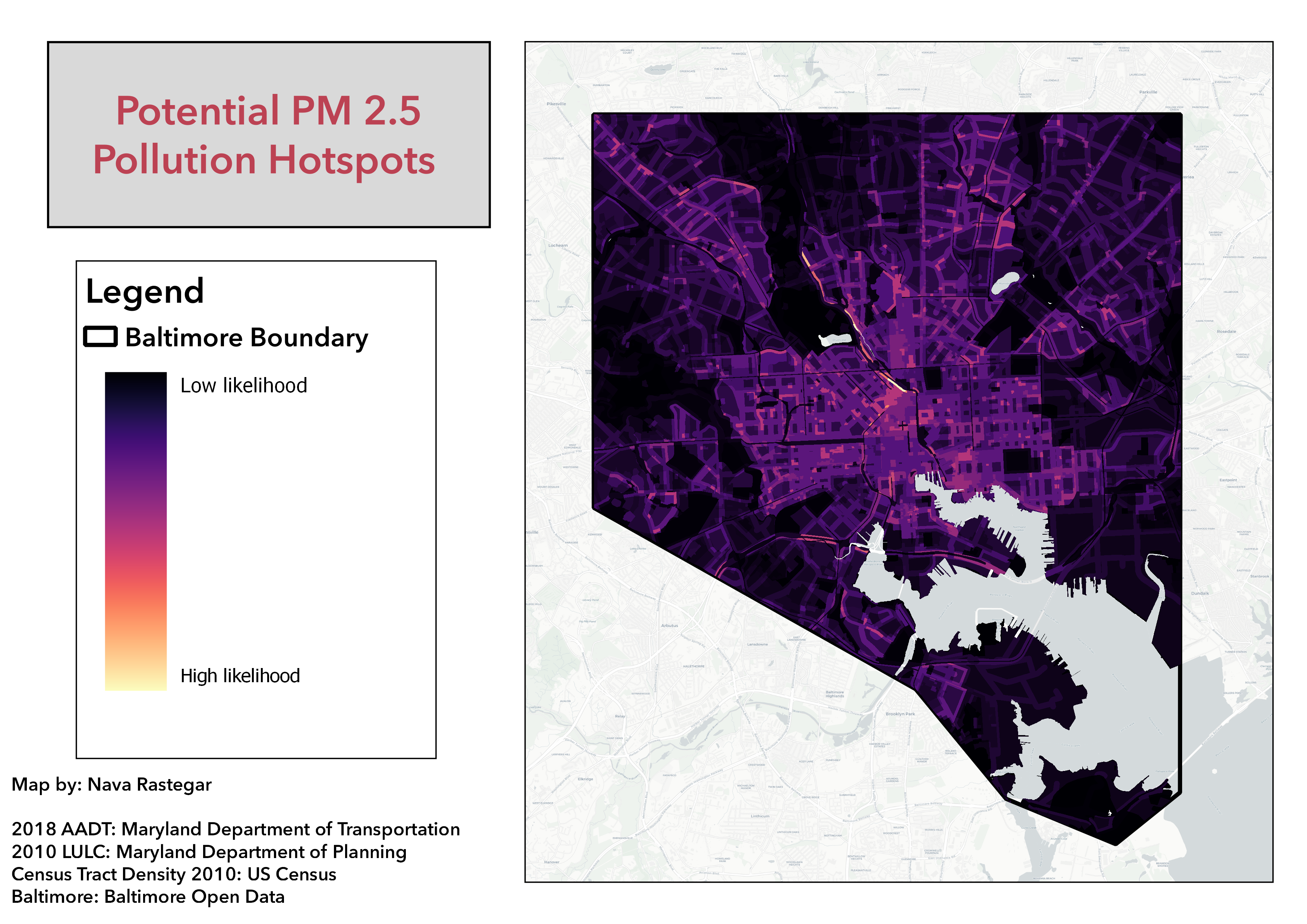
The map below shows areas that we would expect to be hotspots of air pollution based on several factors that are known to be correlated with partculate matter pollution: traffic, population density, and land use. Each individual factor was mapped, and then classified into weights. Each land use factor was weighted from 1 (low impact use) to 8 (highest impact use). Roadways were given a buffer of 100 m, a common distance used to predict the areas of high particulate pollution from car exhaust, and then classified into weights of 1-4 by quantile based on AADT of 2018. Density was classified into weights of 1-4 by quantile based on 2010’s census density. All three vector layers were converted to rasters, and then multipled together using the raster calculator to create the map of expected hotspots below. These are only three of the known factors that contribute to air pollution, and although the weights are basically arbitrary, I think this map gives a good idea of how much air quality can vary within small distances.
Next Steps
Create a land use regression to obtain more accurate coefficents for each contributing factor.
This project was completed using R and QGIS.